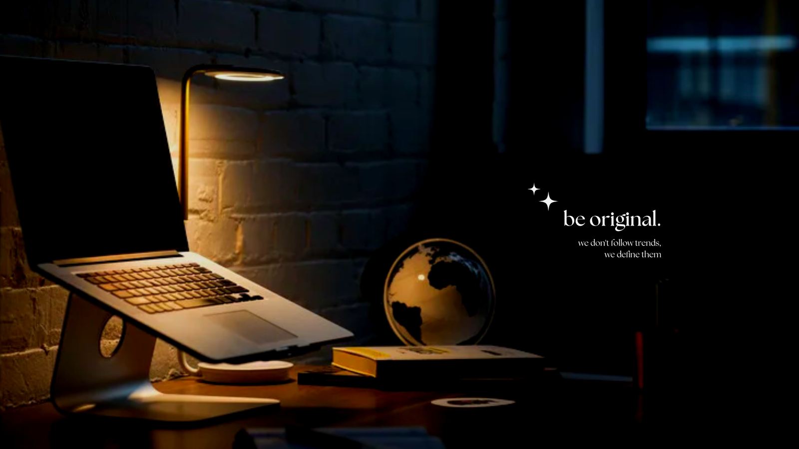
BEYOND
Branding
Timeline
Client
1 WEEK
GROUP 4
Beyond is a studio with a focus on creating designs that are beyond visuals, limits, and expectations. In this project, I mostly worked on the graphic design, namely, colors, font, visuals, logo, and icons.
INSPIRATION
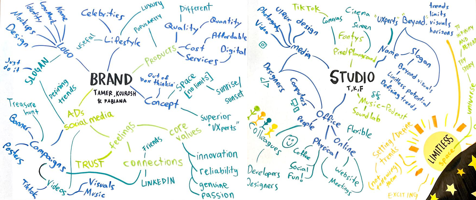
We approached the inspiration phase of this project methodologically. We used mind mapping method that helped us define our mission, find a suitable name and a catchy slogan. I tried to write as much as possible using the color navy blue.
MISSION
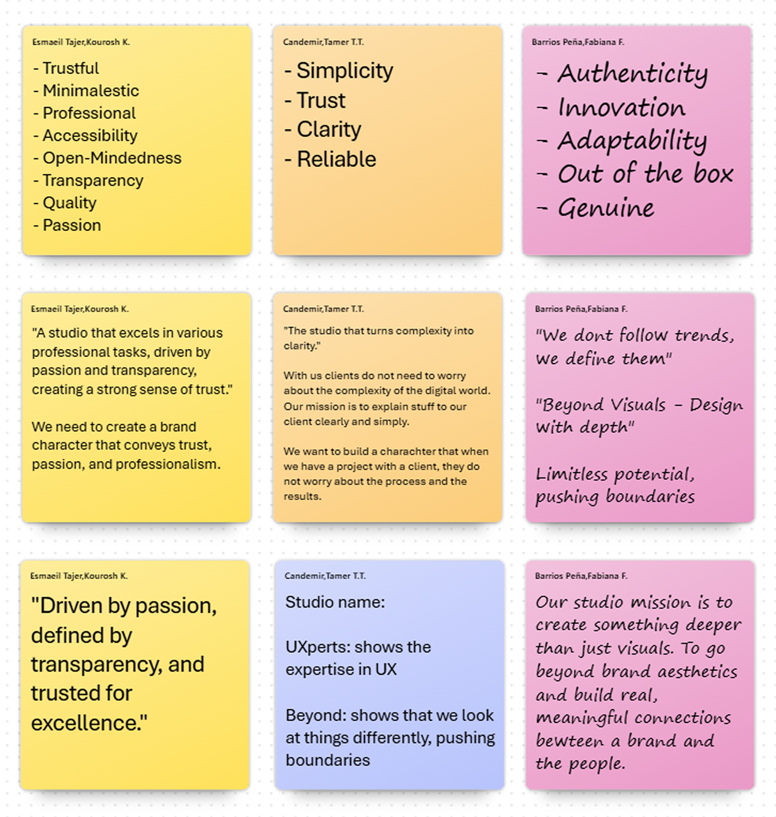
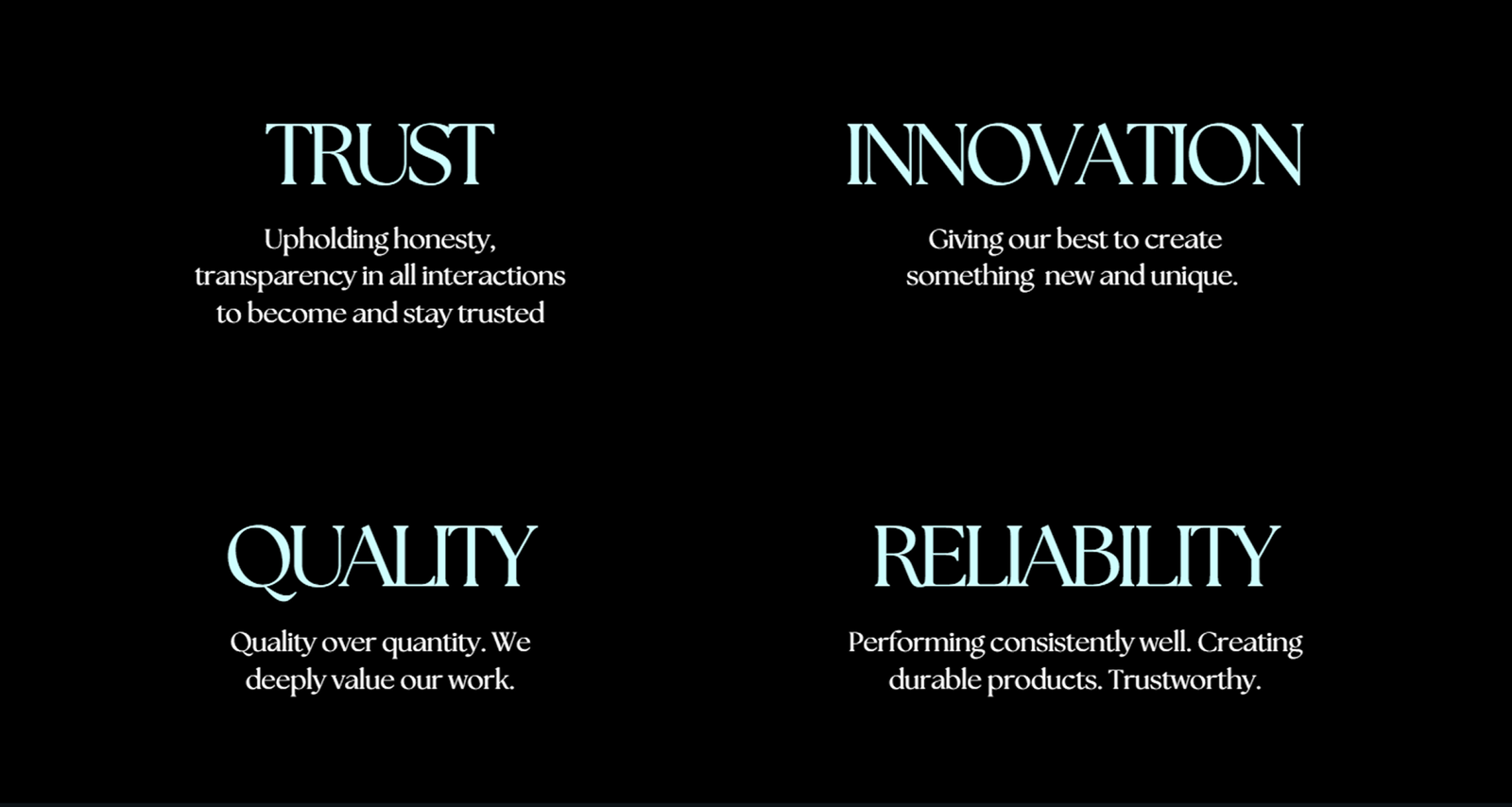
Our mission is to create something deeper than just visuals, by maintaining trust and quality. We want to go beyond default brand aesthetics and build real, meaningful connections between the brand and people.
MISSION
DESIGN
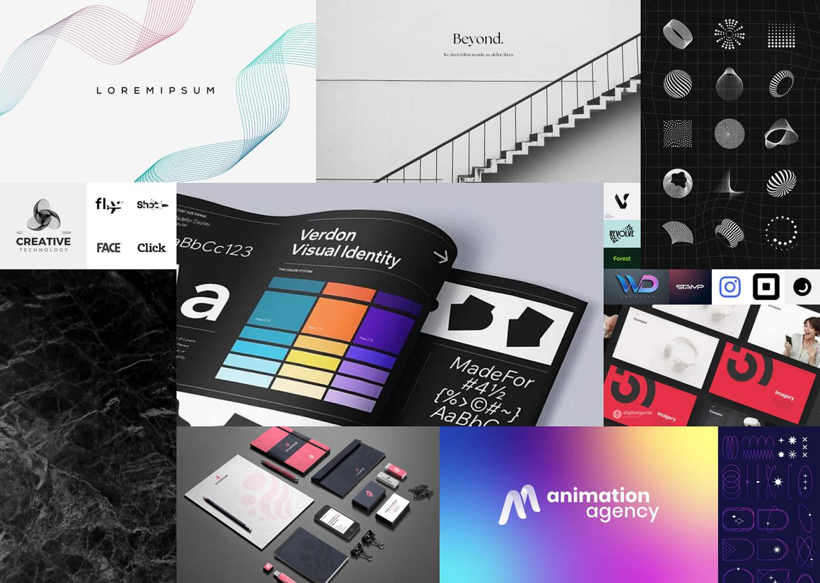
I collected various design ideas in a mood board. Being inspired from the mood board, I created a stylescape, having several iterations for the logo and the color palette.
COLOR PALETTE
I created 3 different color palettes by iterating on the previous one. Every iteration is made based on peer feedback.

LOGOS
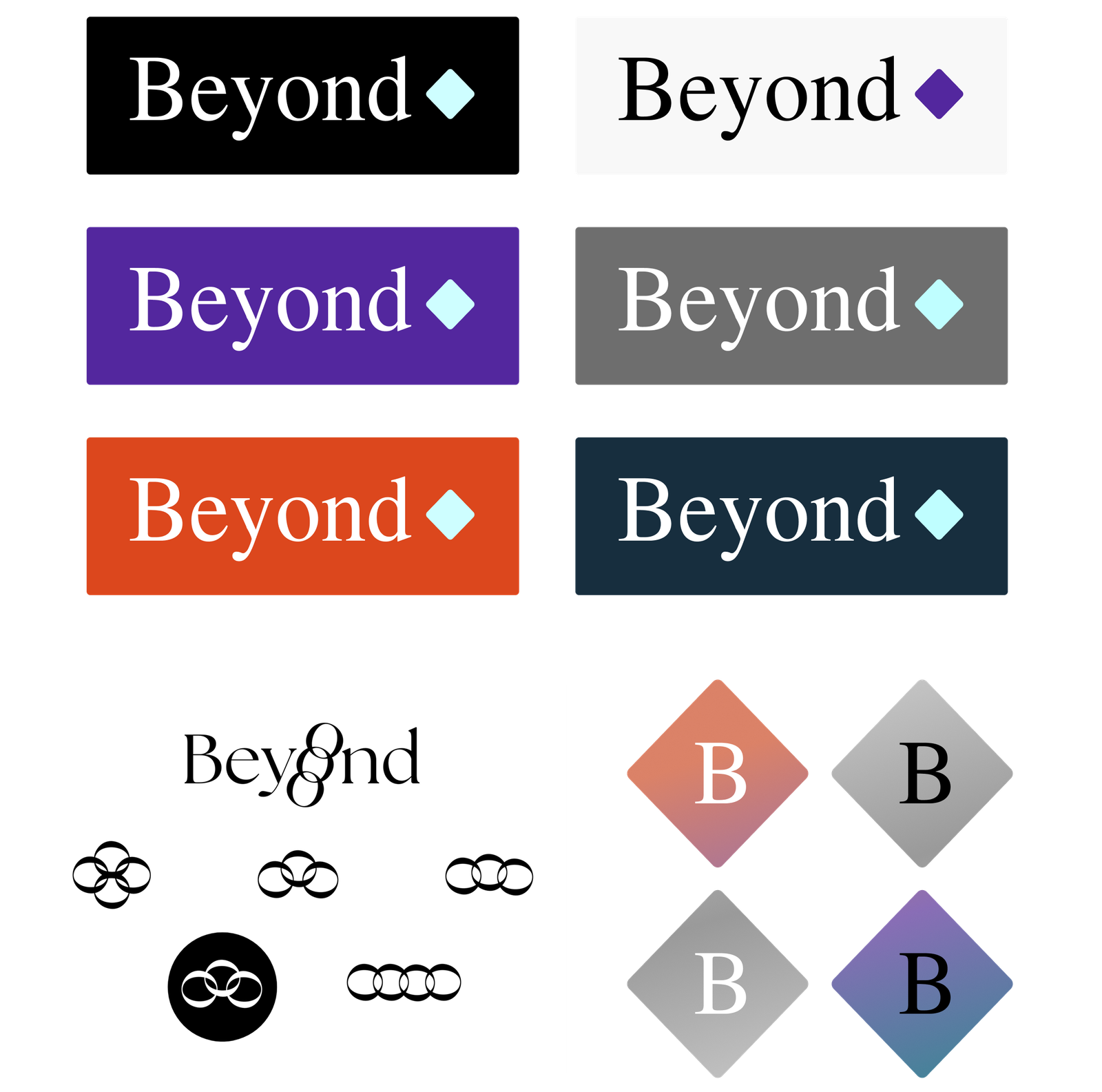
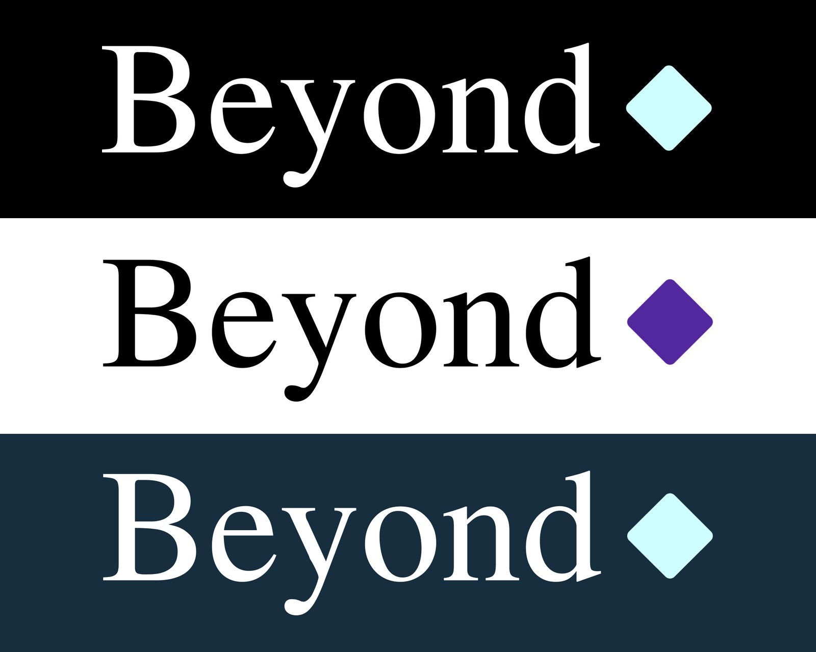
I created several logos, tested them on different backgrounds, and we agreed on using one of my designs.
FINAL LOGO
STYLESCAPE
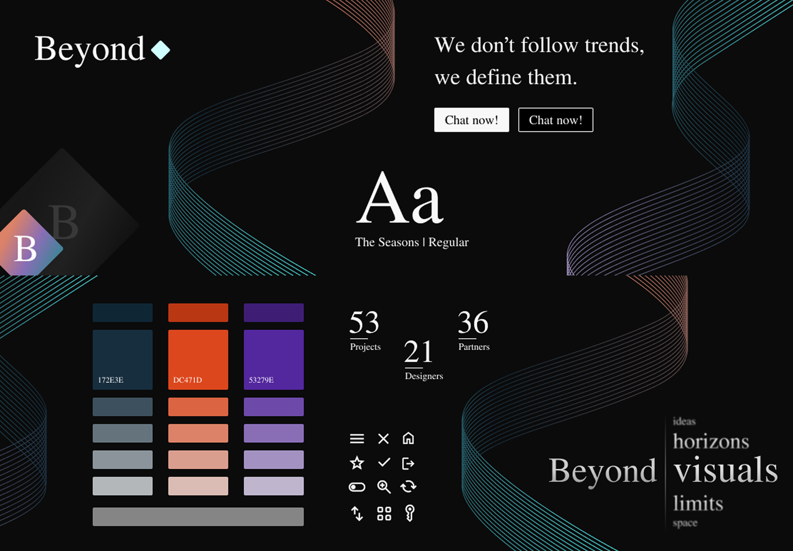
I gathered my designs in a stylescape. Adding the font, a slogan, visuals, and a campaign idea, I had the final version in my hands.
PRESENTATION
Before we moved on to making a brand guide, we had 2 feedback sessions with 4 different teachers. What
they all noted was that our mission was too broad, and what we promise to deliver was too general.
After having a long discussion as a group, I managed to convince them to go for rebranding. With a
narrower and more specified mission, we decided to turn this into a project in which we will learn and
have fun at the same time.
